The Patio Place website redesign from 2017 while working at an advertising agency.
Table of Contents
Project Overview
The Goal
I was tasked with redesigning the website to create a modern and mobile-friendly site that directs customers to directly contact the store for sales. The clients wanted the site to have a personality and plenty of color. They also wanted the site to be able to notify customers of new sales, promotions, or updates to their order. Creating a Progressive Web App allowed me to implement native notifications and for the site to be ‘installed’ along other apps on the phone for easier access.
My Roles
UX Designer
Created wireframes and site maps for the designs.
UX Researcher
Conducted user research, competitive analysis, and collected data.
Web Developer
Created the custom website front-end and implemented the back-end services.
Before and After Redesign
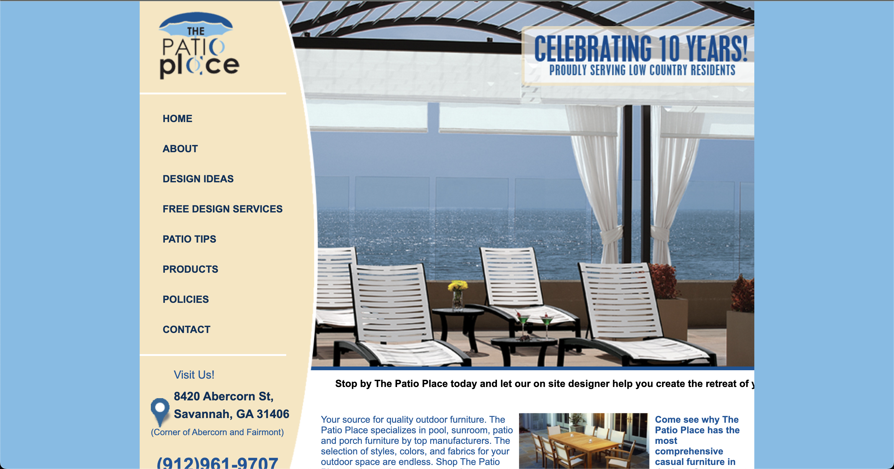
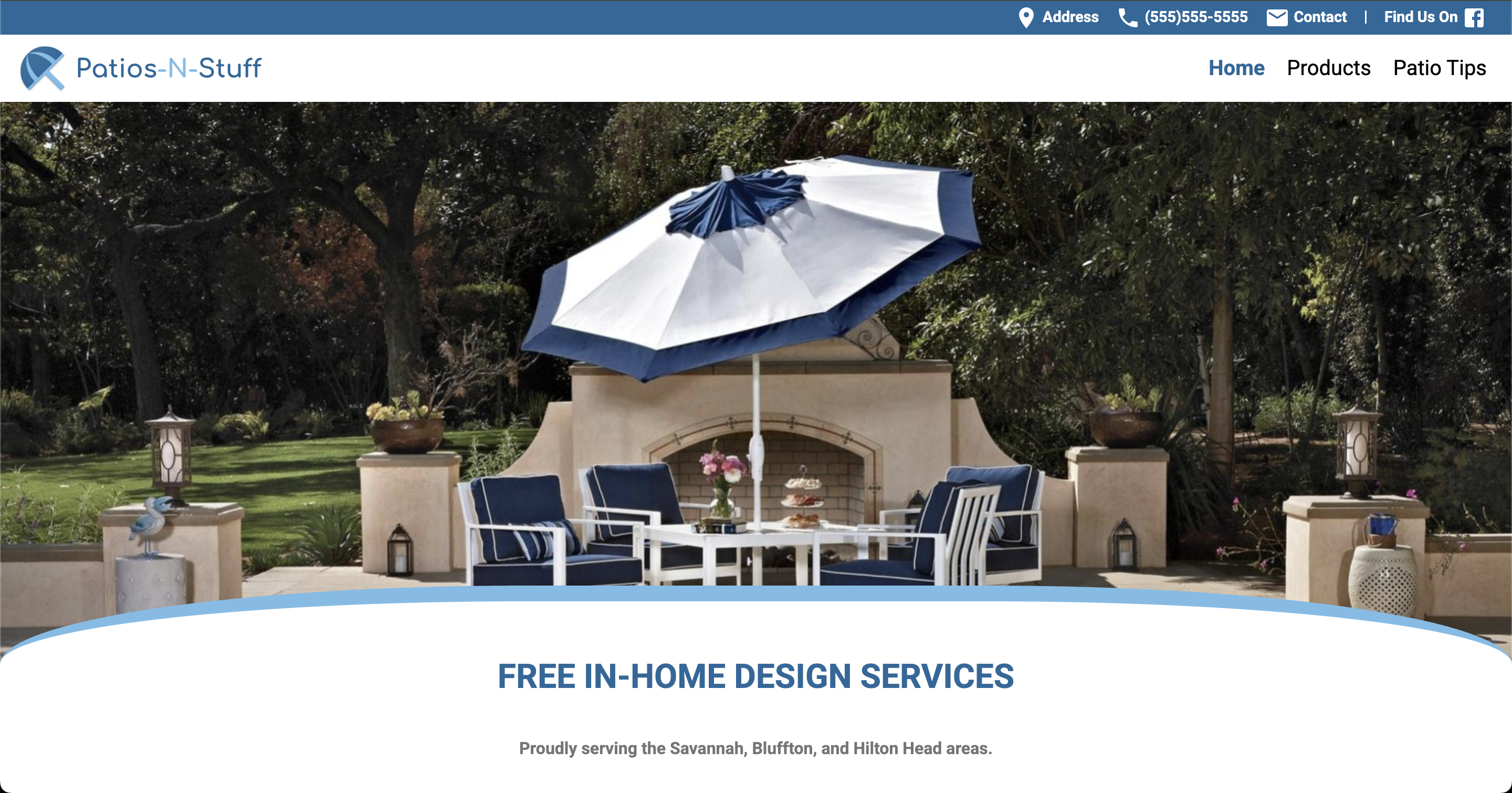
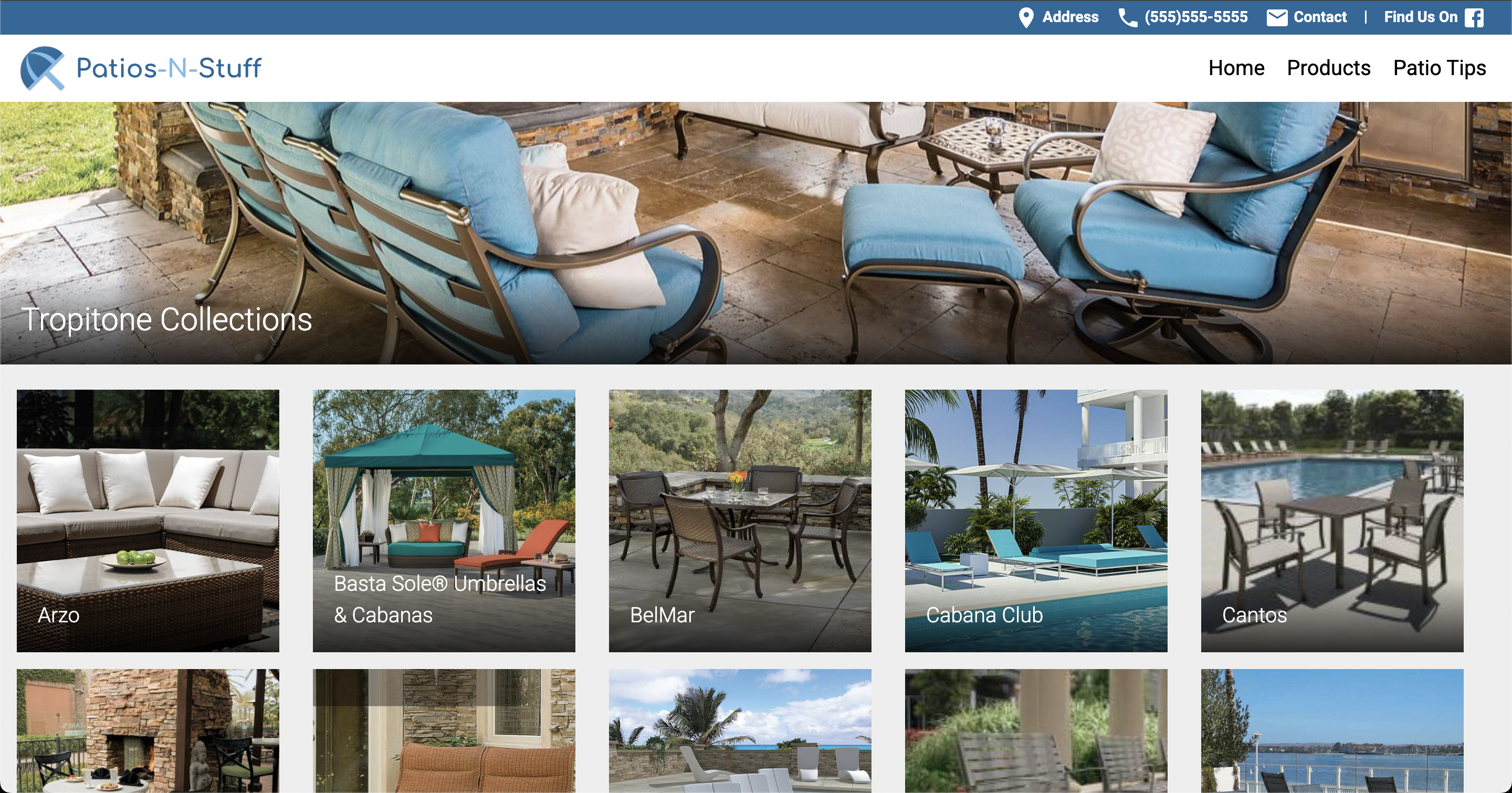
Home Page
Before
After
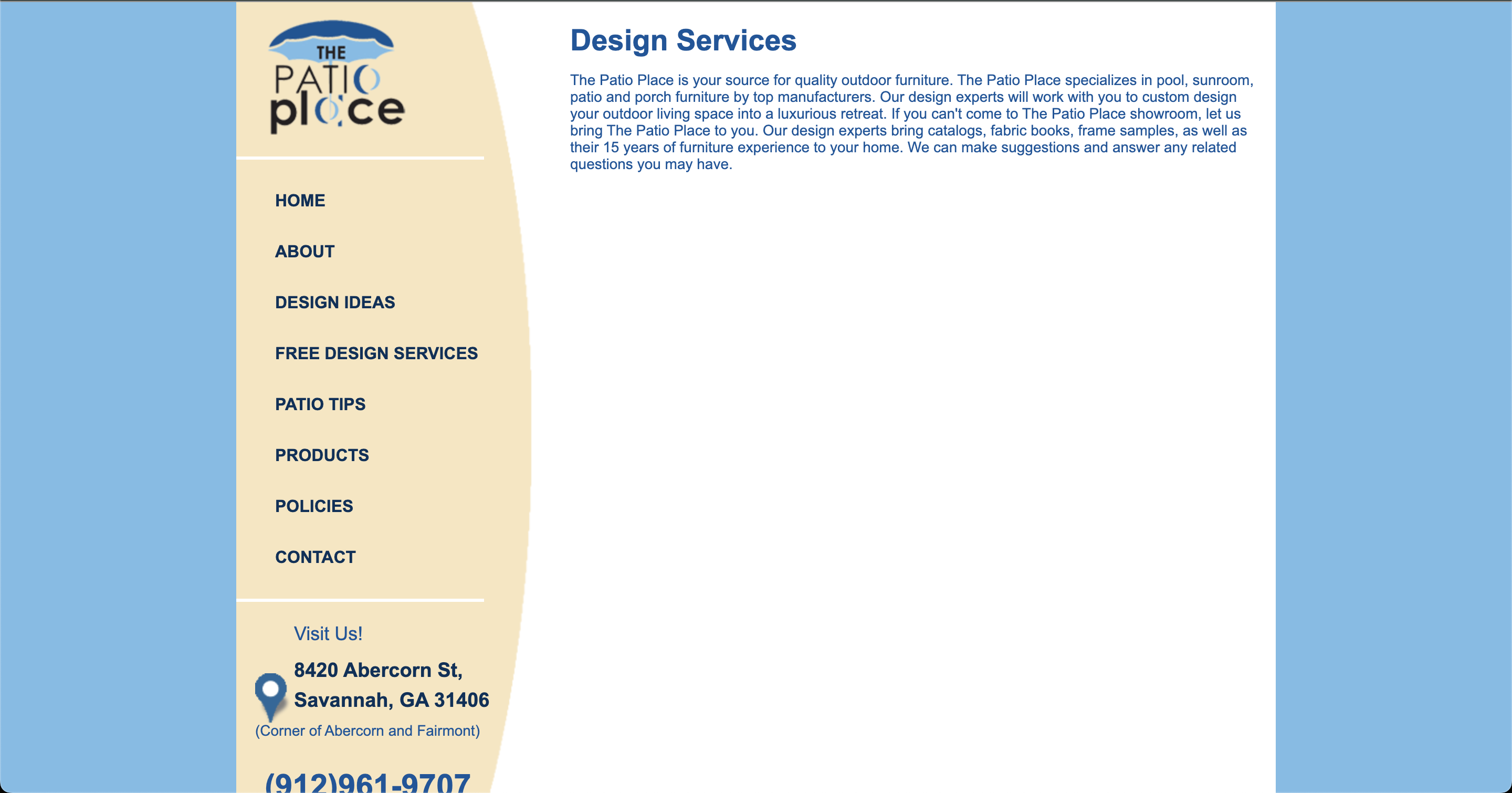
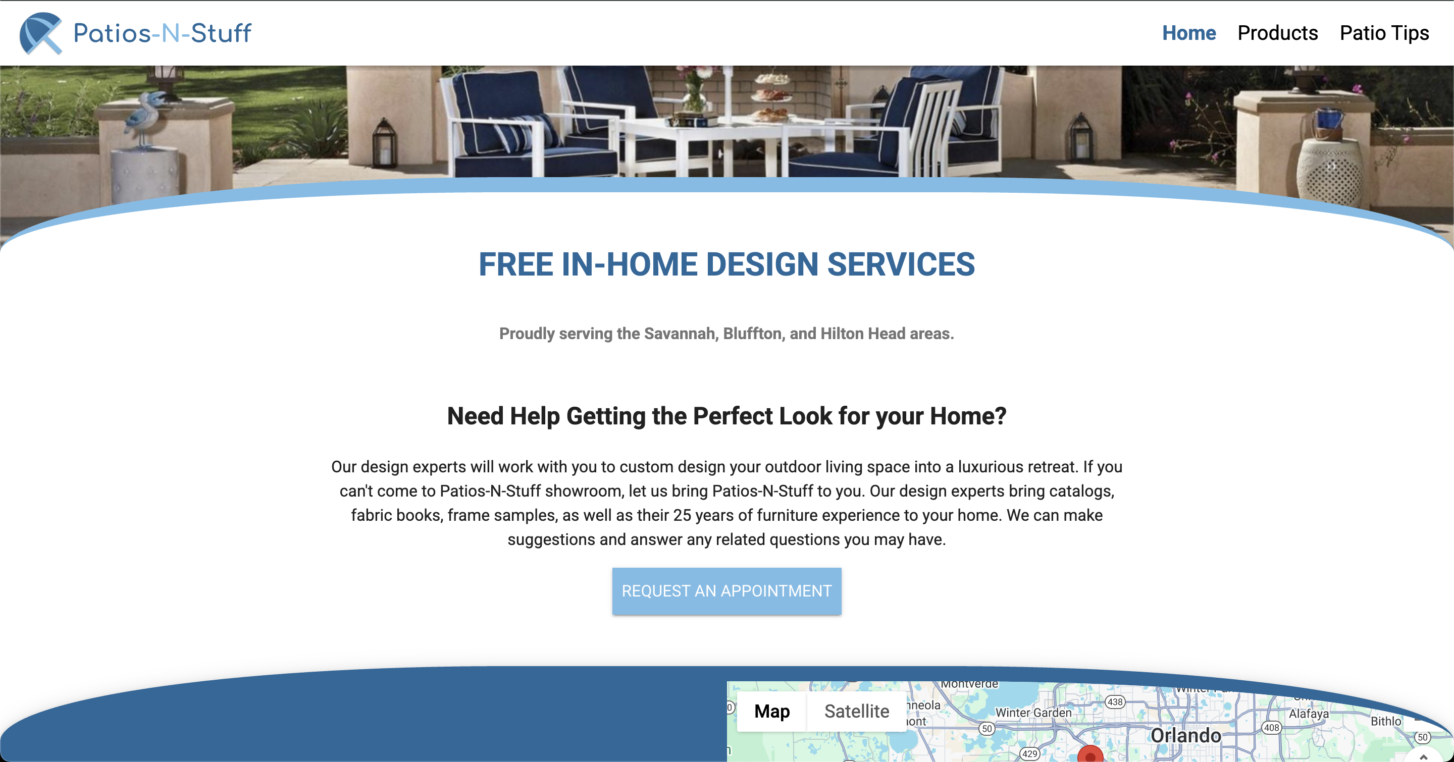
Design Services
Before
After
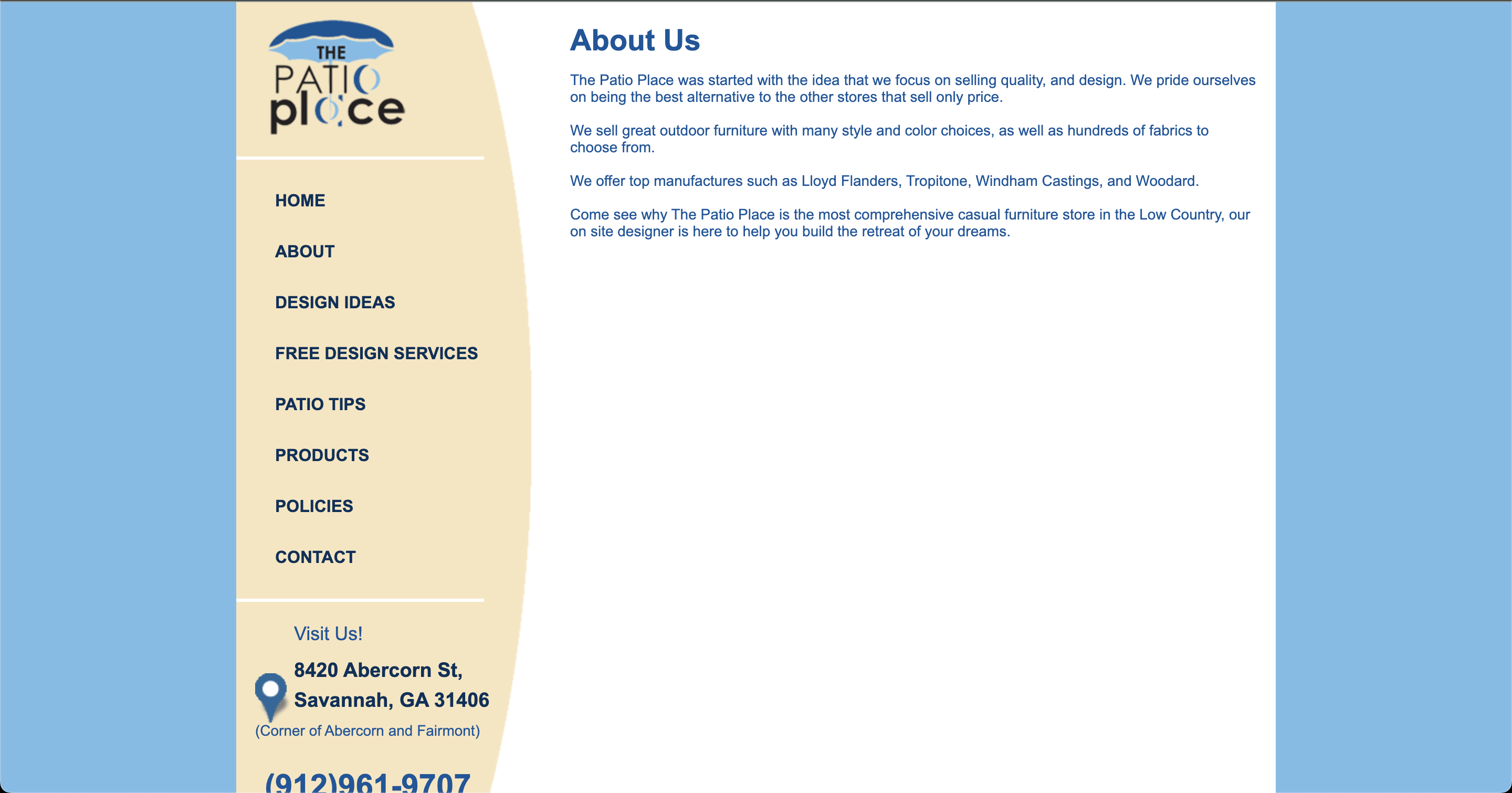
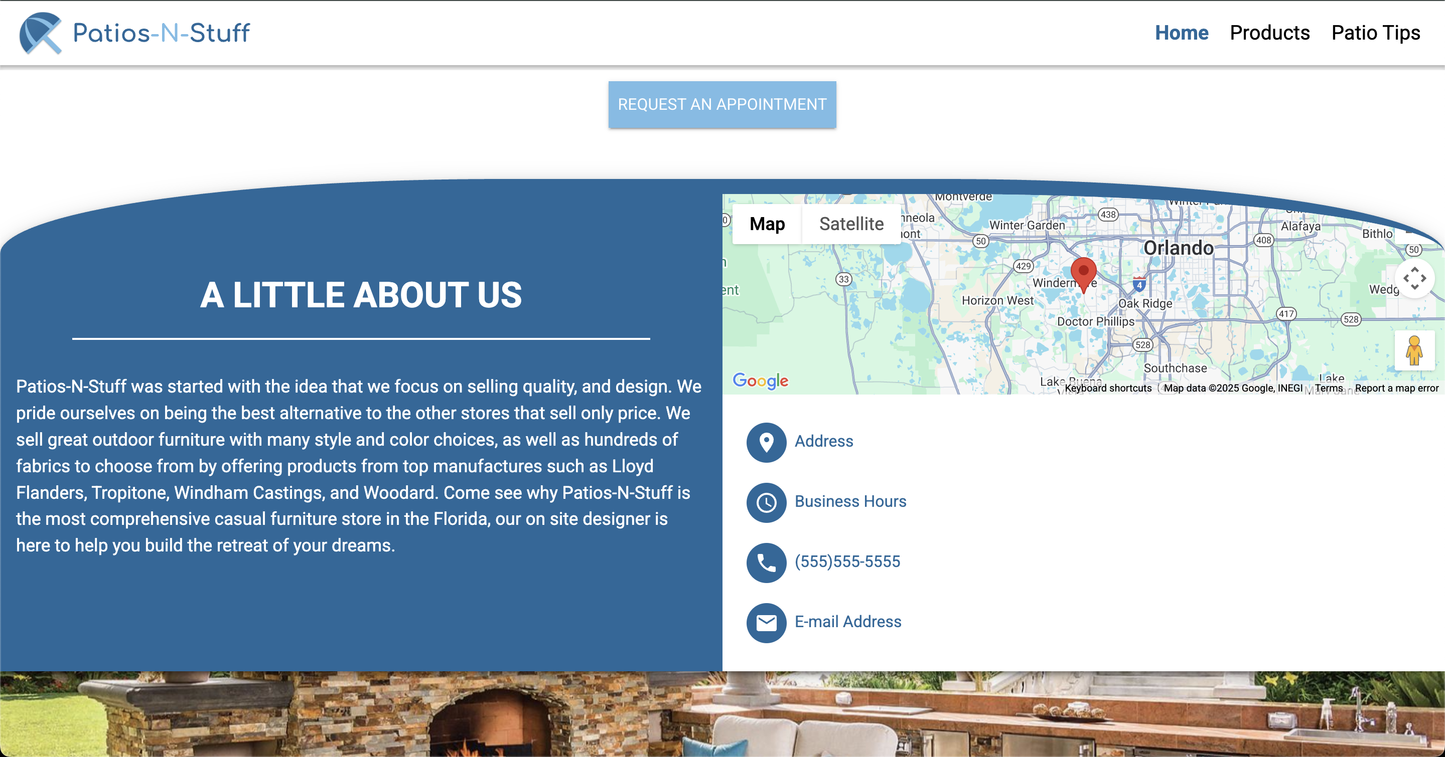
About Page
Before
After
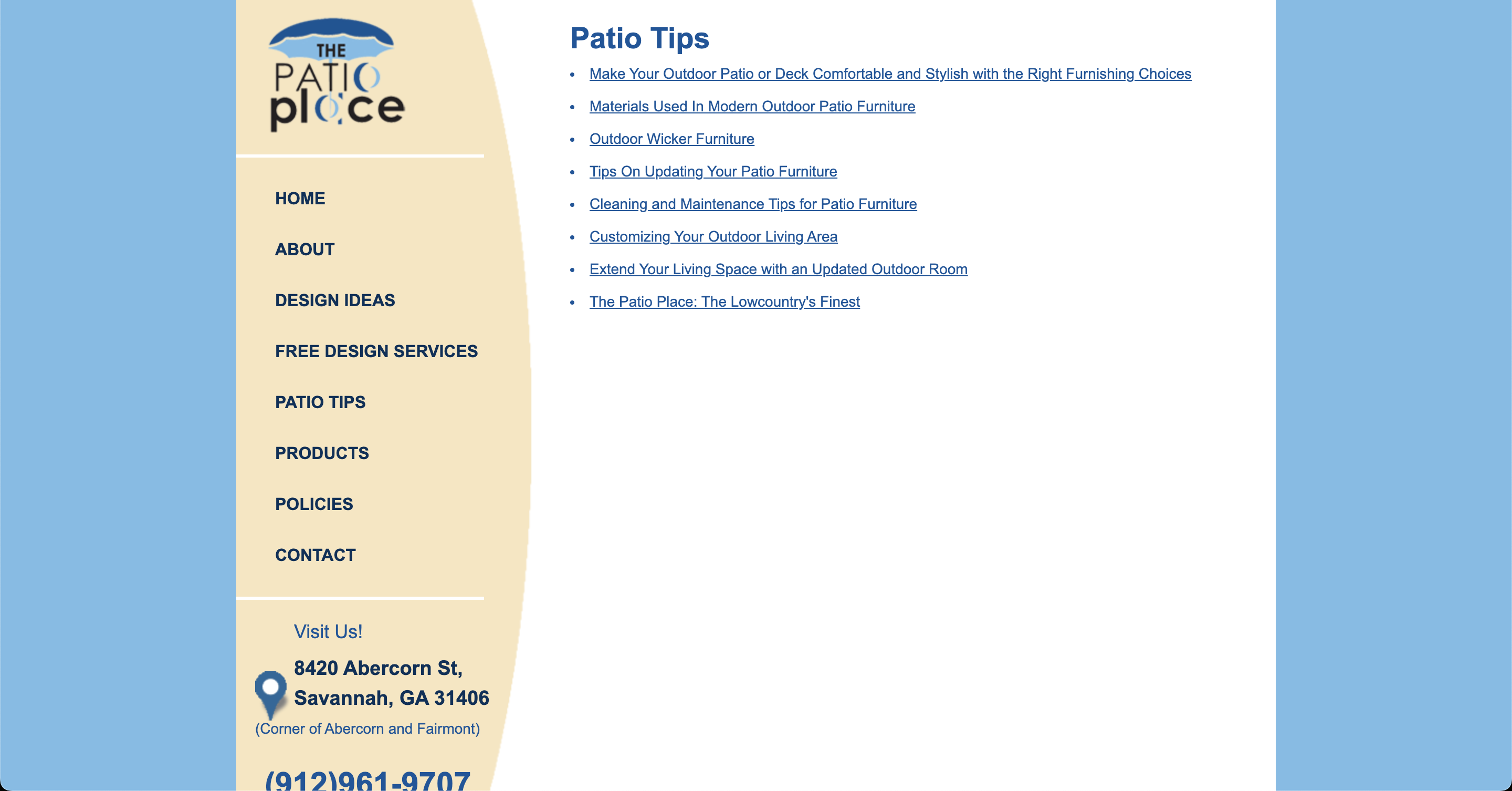
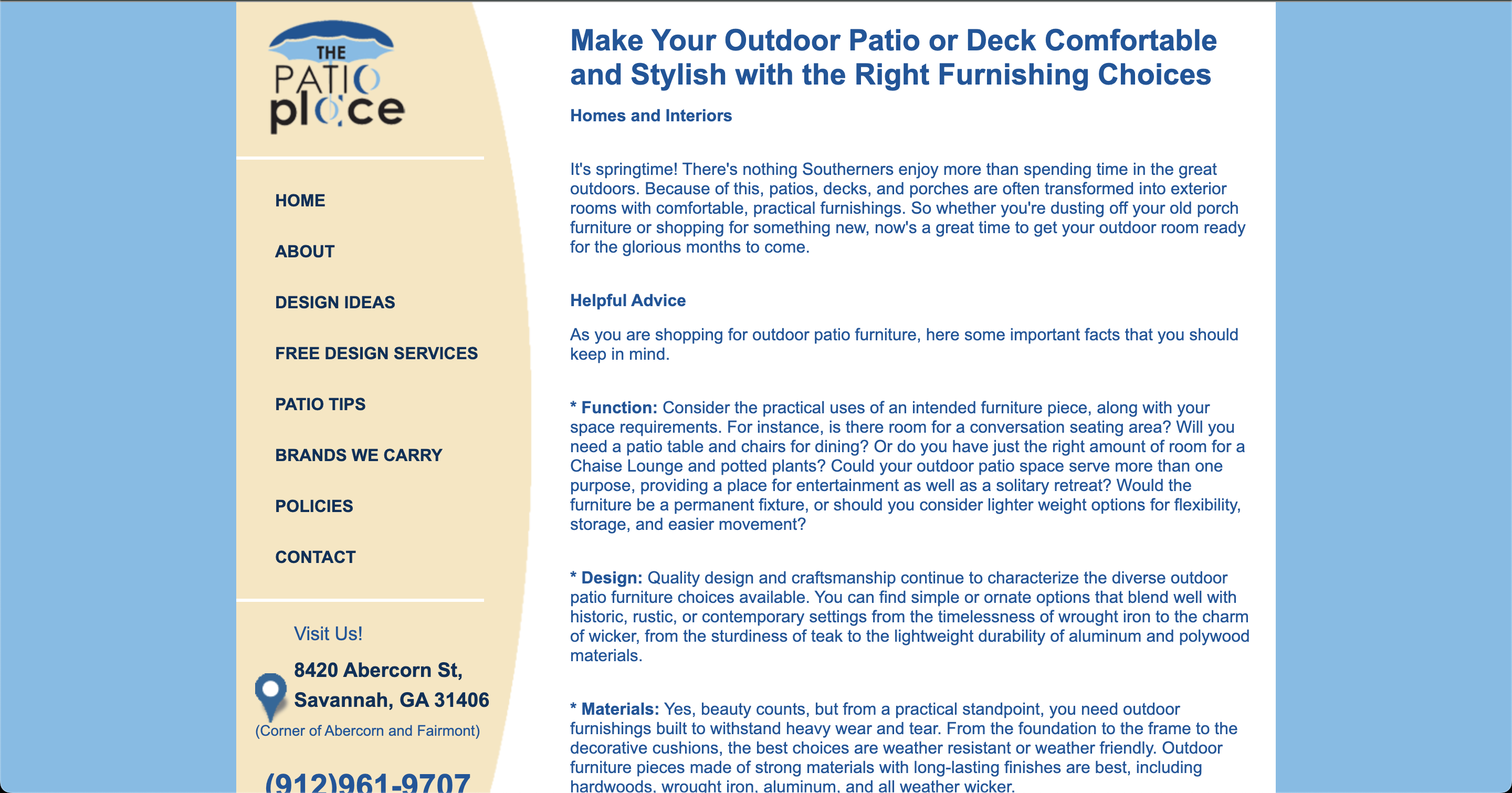
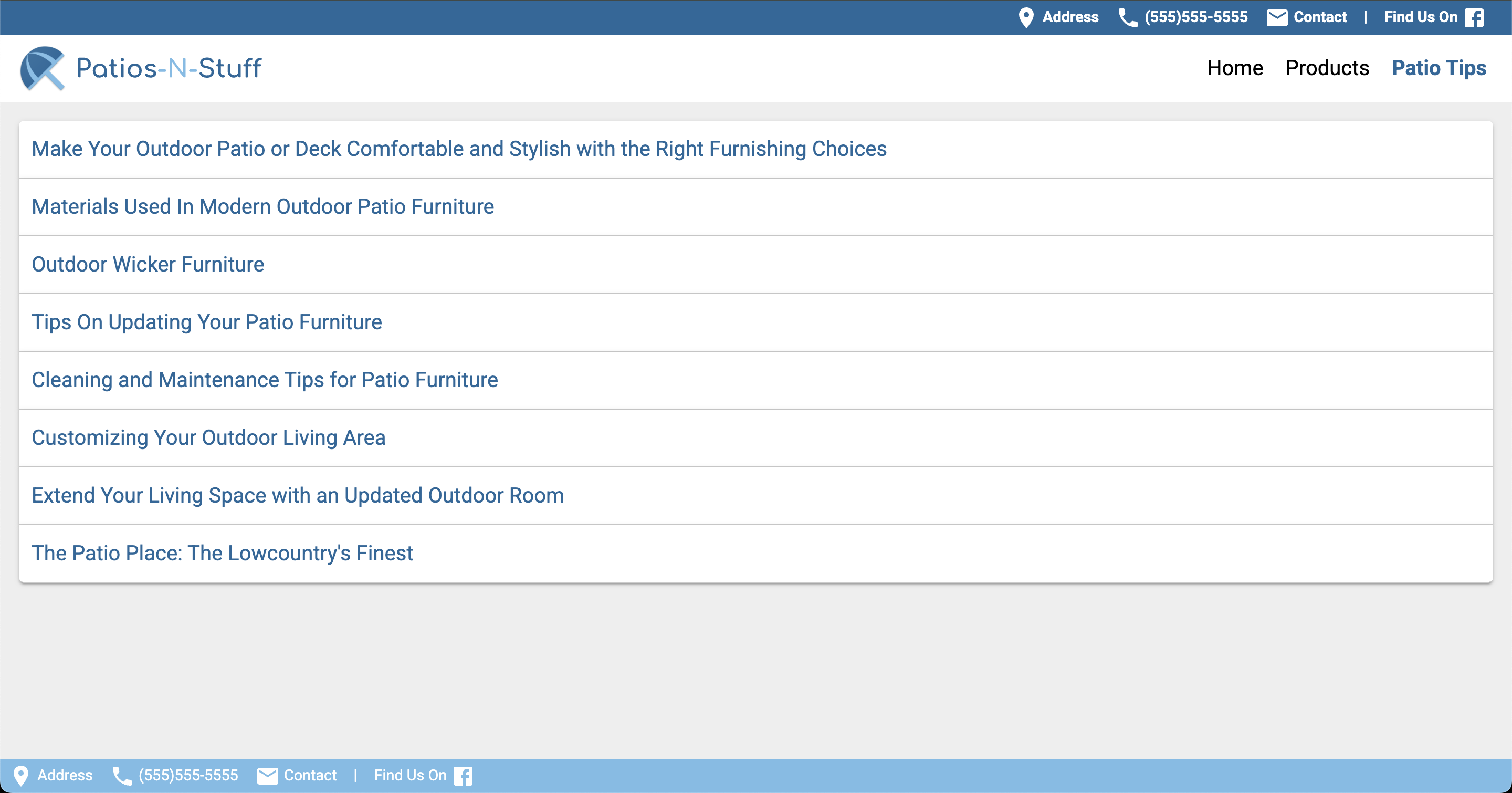
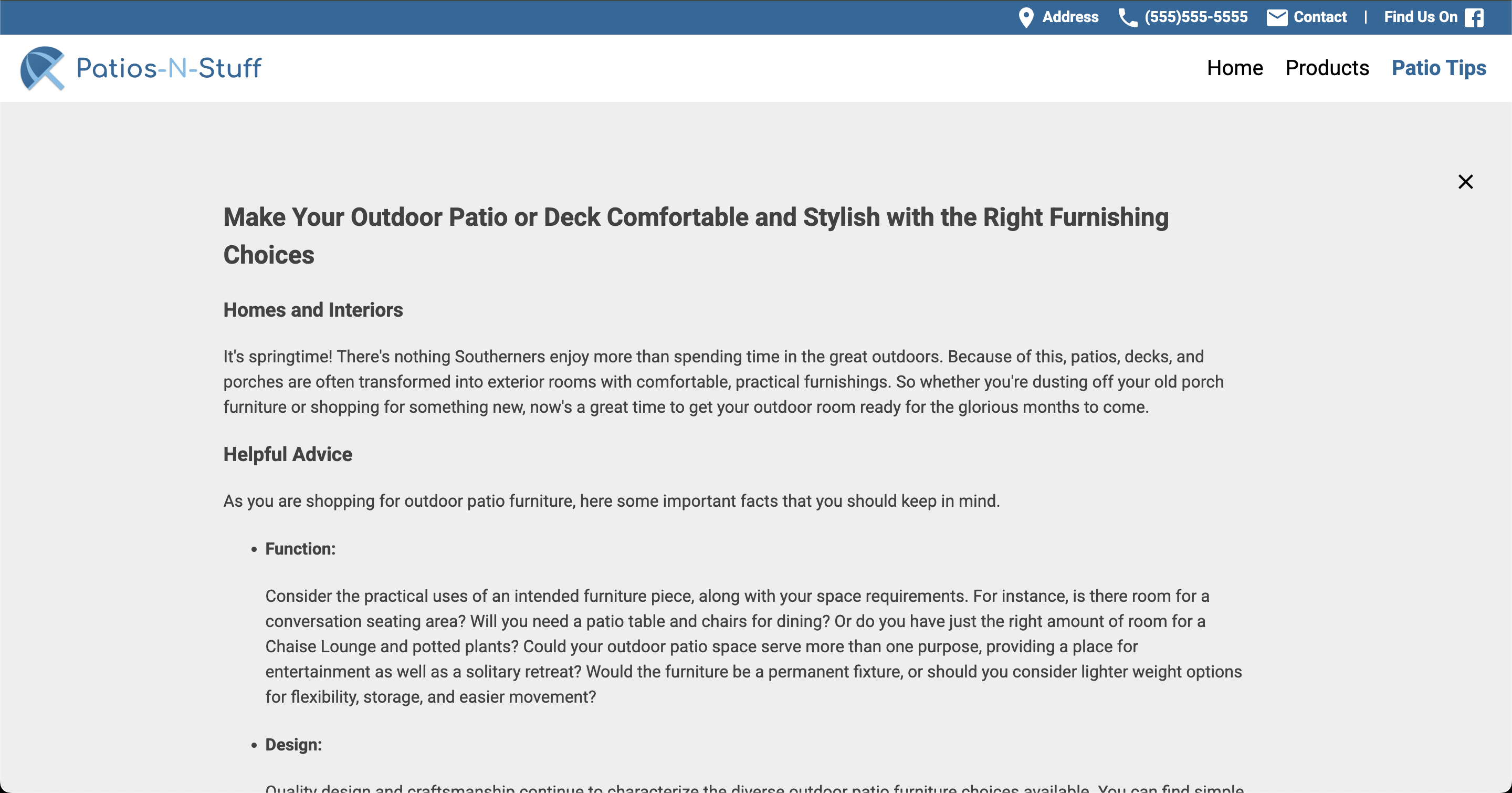
Patio Tips
Before
After
Brands Page
Before
After
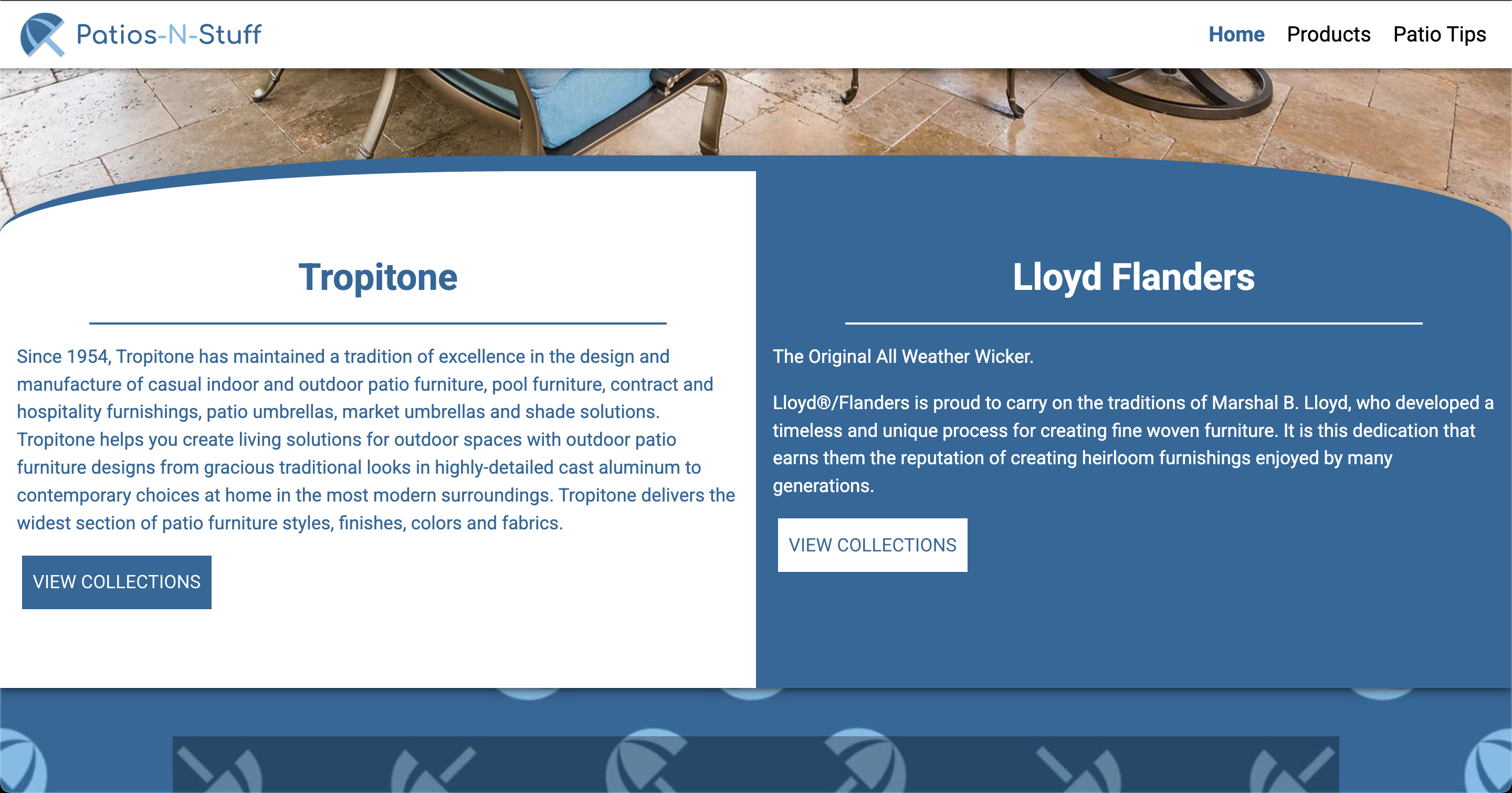
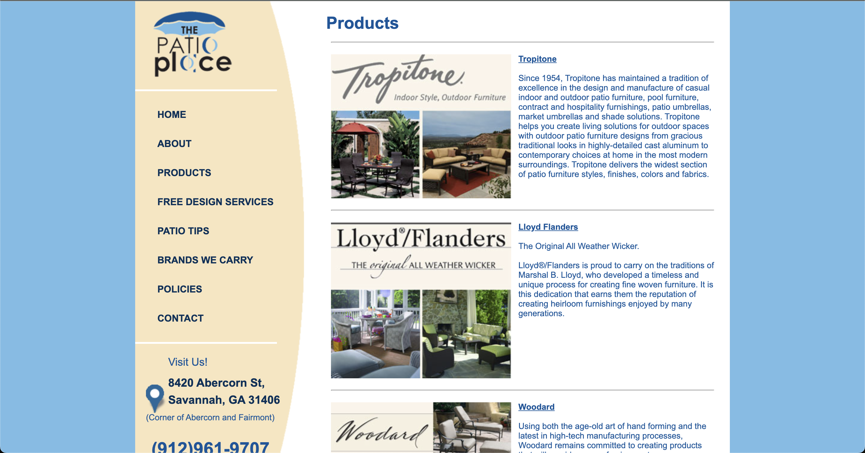
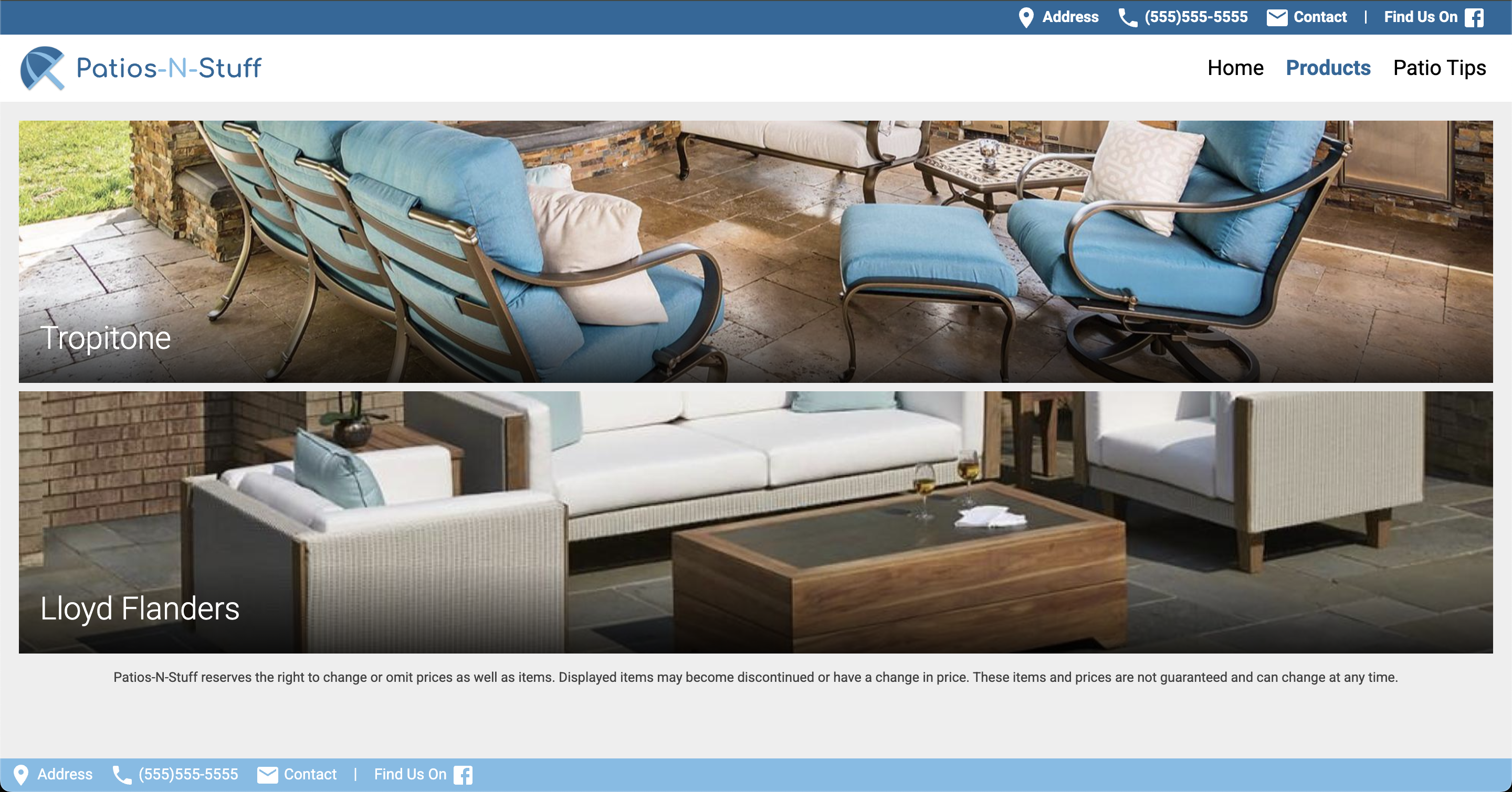
Products
Before
After
Competitive Analysis
I sketched out wireframes of the home pages of the competitors and partners who had recently also either rebranded or refreshed their website designs to be more ‘modern’.
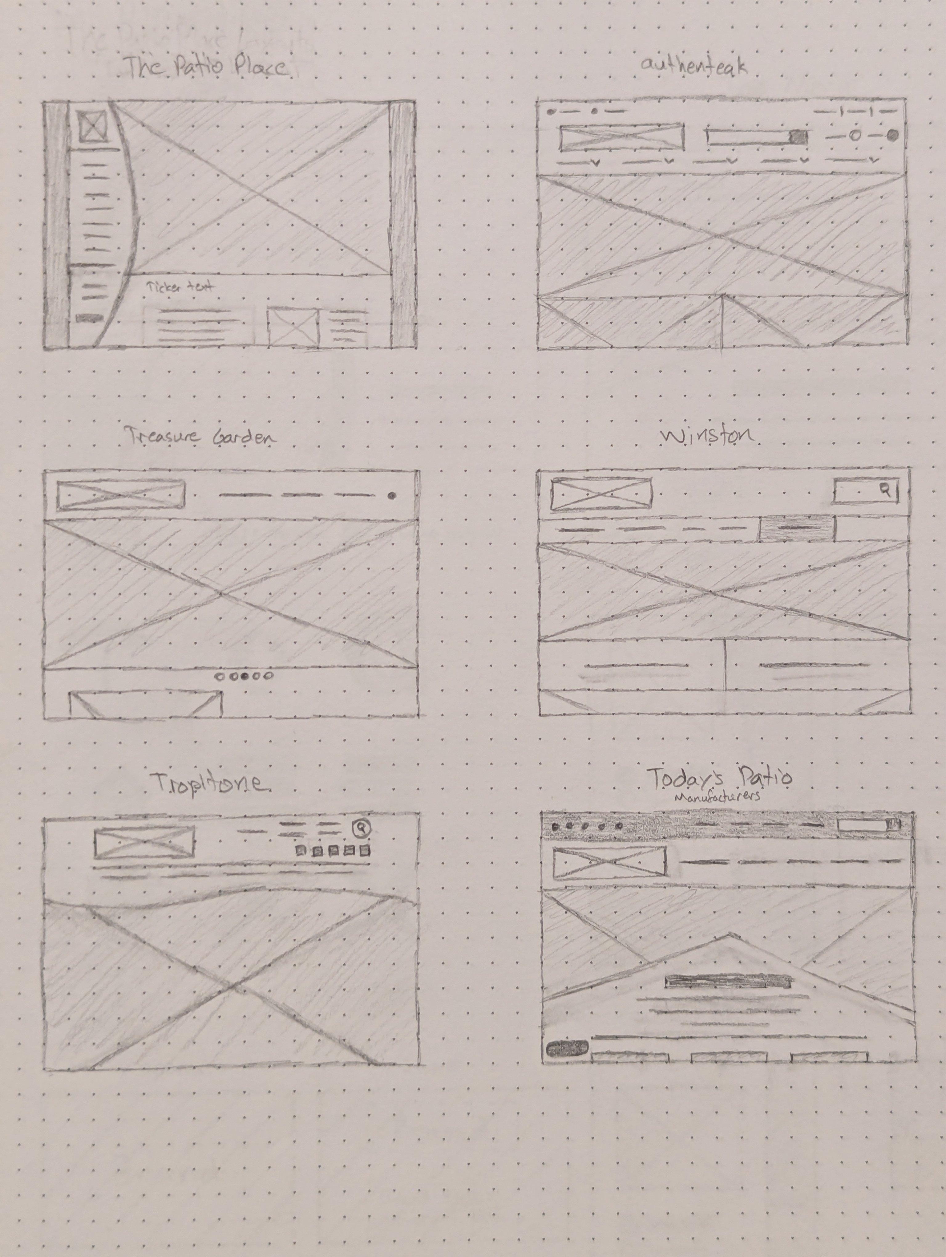
I used Material Design as a starting point since I was using the Polymer framework (which was also created by Google) to build the site with.
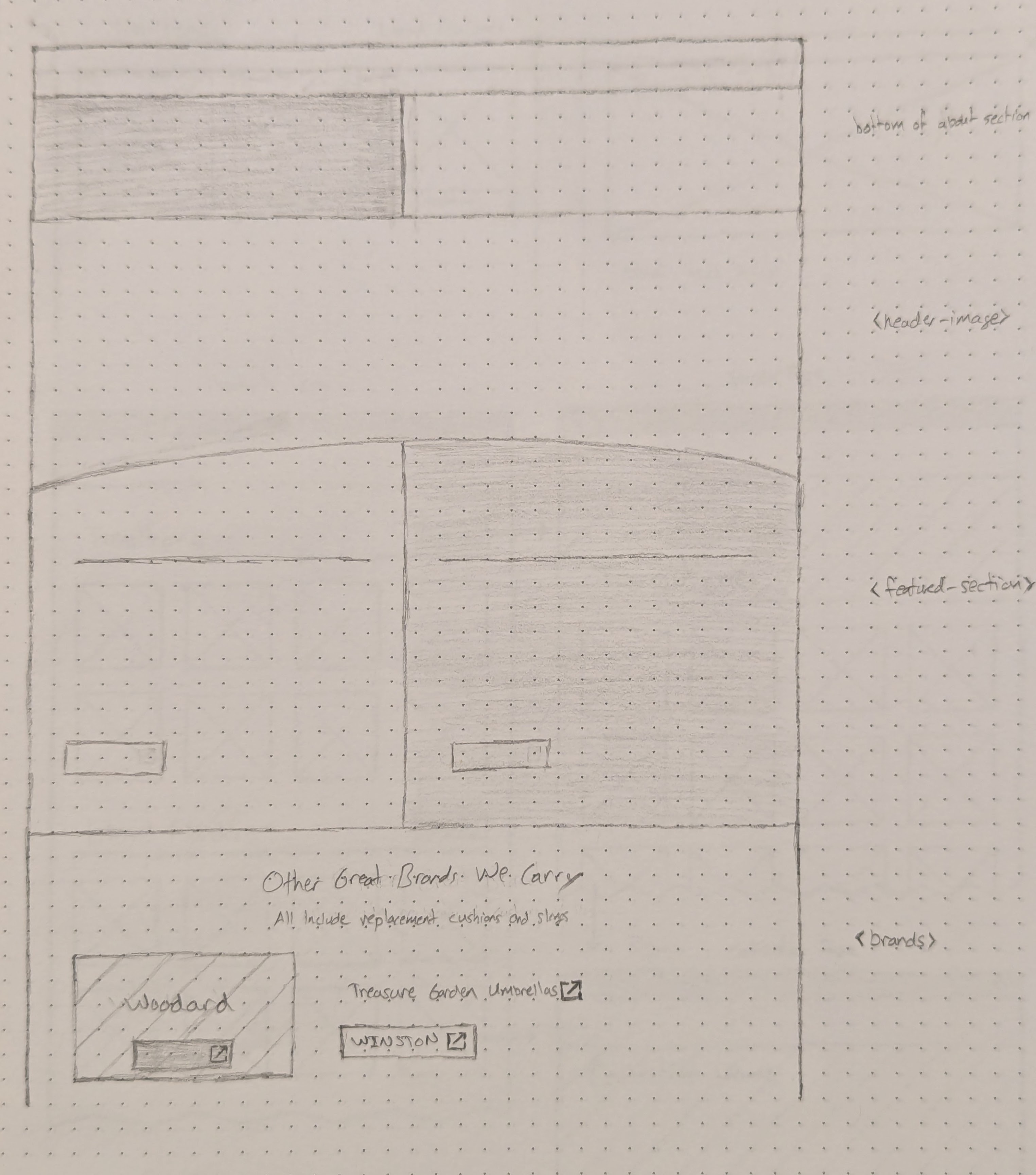
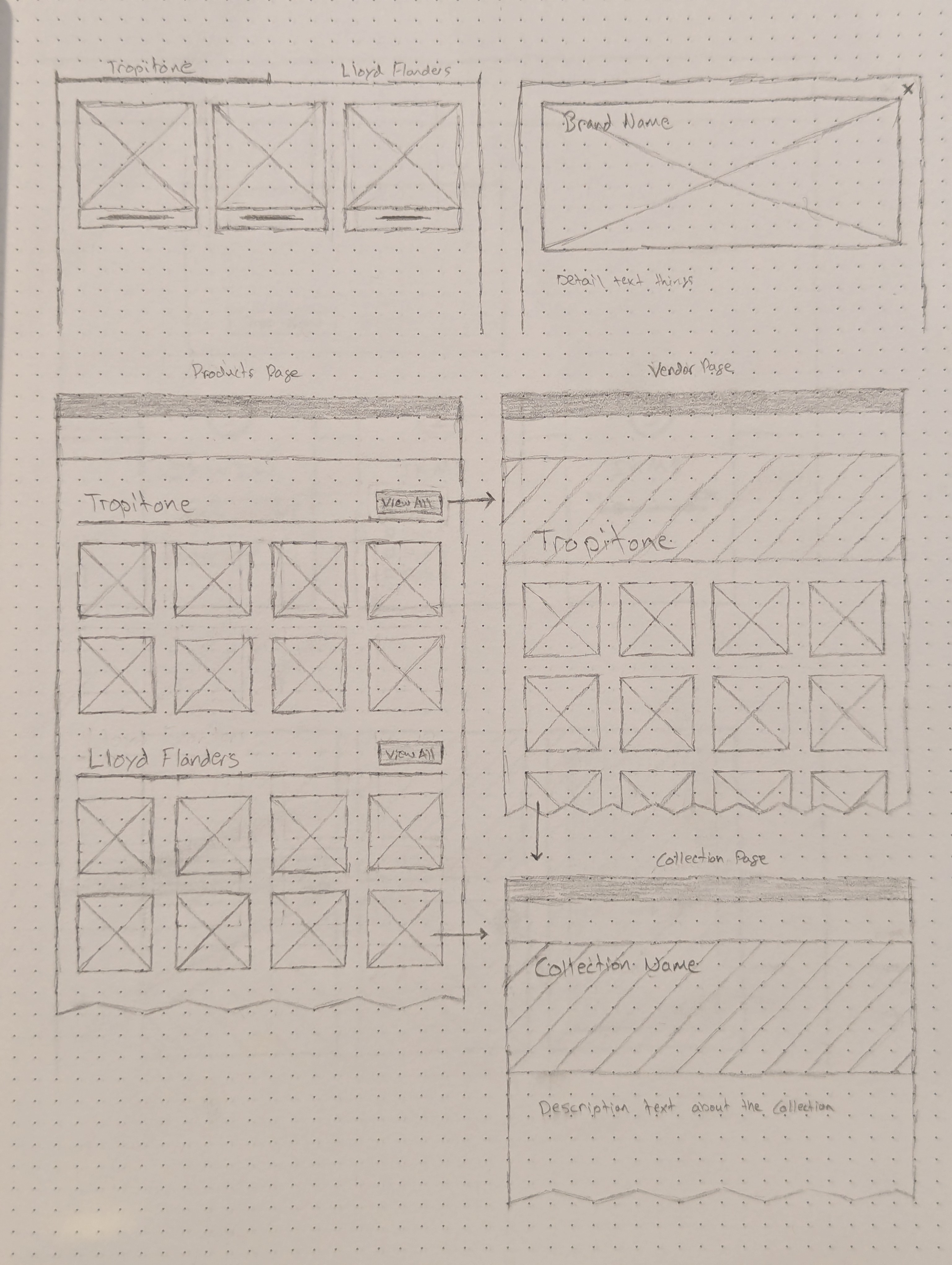
Paper Wireframes
Brand Explorations
In the original design, I liked how the side menu was curved and gave the site some personality. I wanted to translate that curve into a more modern context by using curved section dividers. I was partially inspired by the Tropitone site, which had a kind of wave-shaped separator for the header and footer. I made the curve shape resemble an umbrella since the logo has an umbrella.
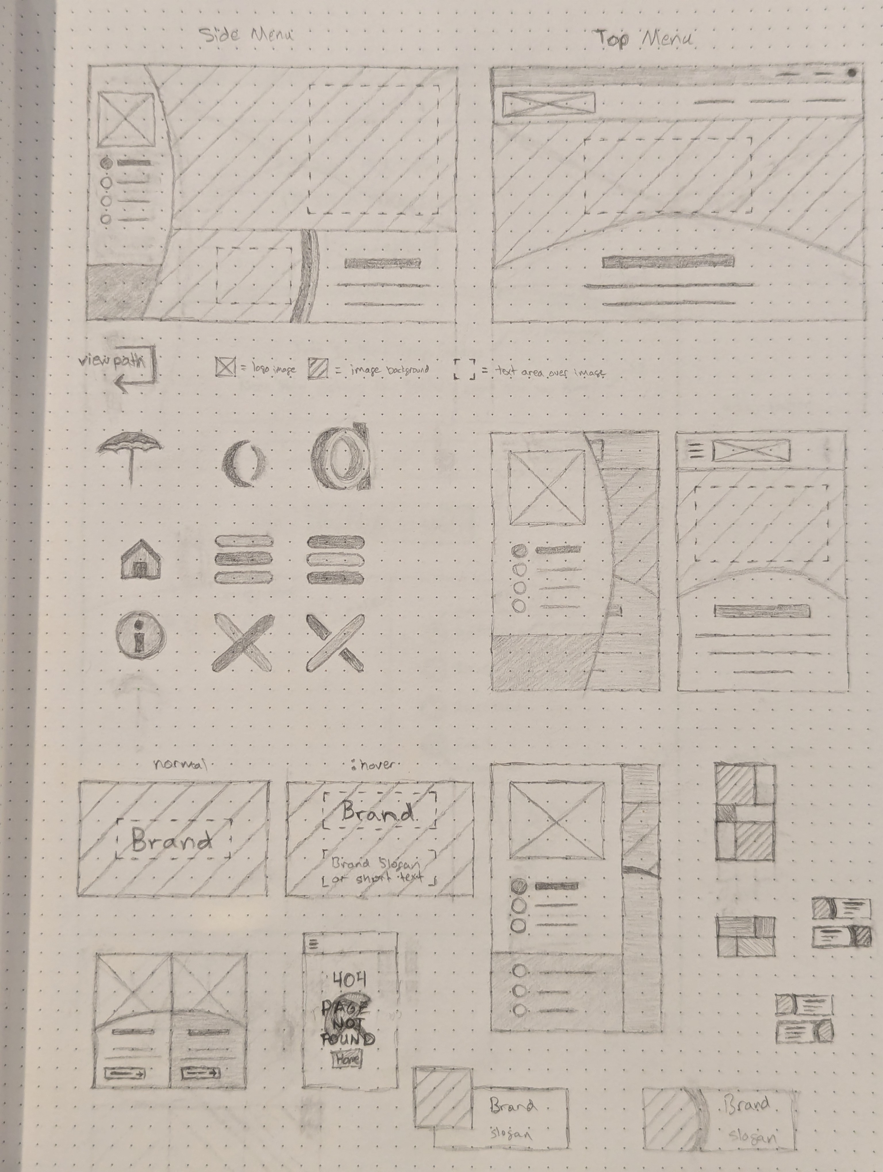
Important considerations in the new designs was to ensure that the site would be mobile-friendly and would adhere to accessibility standards (at the time) with an appropriate visual hierarchy and color contrast.
Final Designs
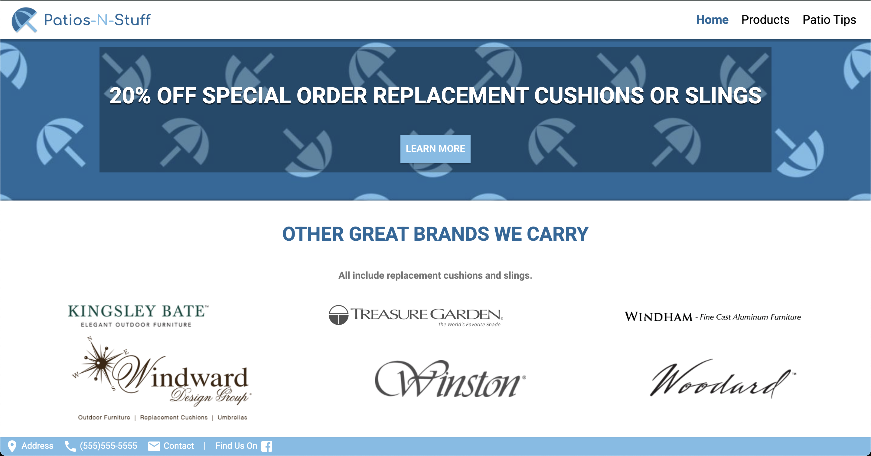
The new home page could grow and shrink while maintaining the same visual language of the curved section dividers and the use of primary and secondary colors. I also moved most of the content from the separate pages (About, Brands, Design Services) to be sections on the home page since they did not have a lot of complexity or amount of content.
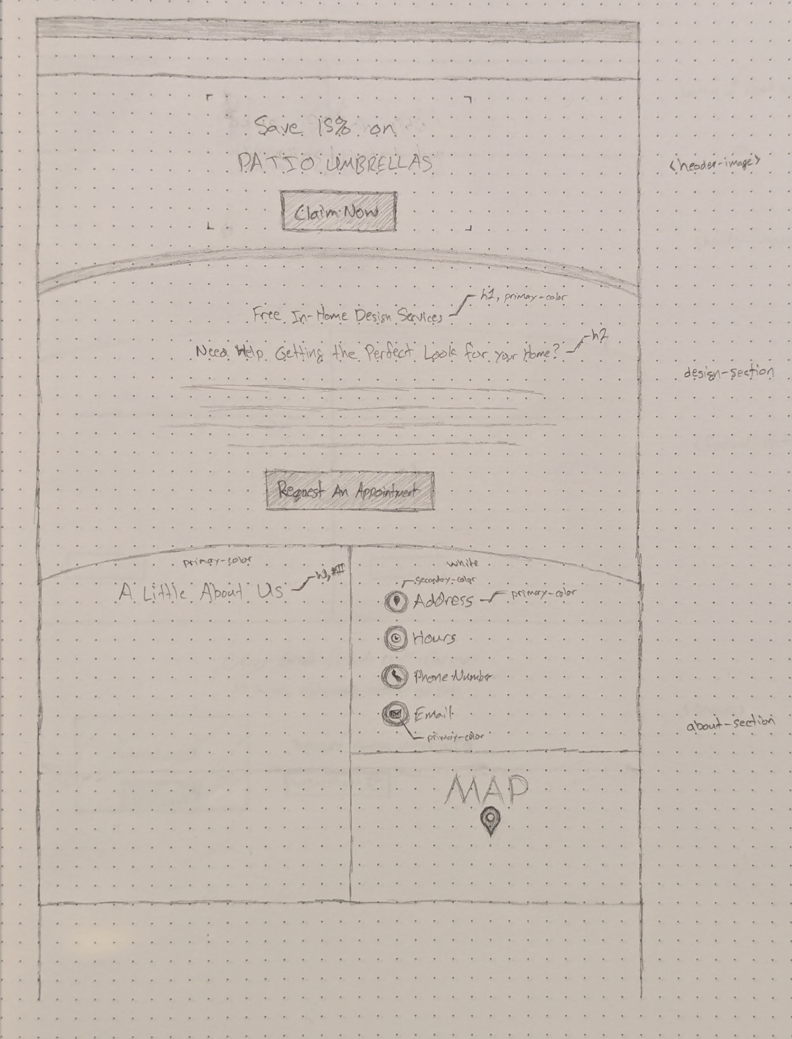
I added some call-to-action buttons for connecting the user to somebody at the actual store so that they could best serve their customers’ needs as well as a way to draw in new customers with a coupon offer.
Outcomes
Clients Approved Designs
The clients approved of the final designs and assisted in giving images to help fill out the product collection pages.
Clients Wanted A CMS
After initially stating that they didn’t want a Content Management System (CMS) to maintain, the clients ultimately decided that they wanted a CMS to be able to make their own updates instead of going through us.
What I Learned
Client Taste
Some clients may not know what they really want until they see it and will change the scope given the opportunity.
Rapid Iteration
Being able to rapidly iterate with the client is important for keeping the momentum going for the project.
Communication Is Key
Keeping an open channel of communication for questions and feedback was helpful for preventing unnecessary work further in the process.