Mobile app that helps customers keep track of and diagnose issues with their houseplants.
Table of Contents
Project Overview
The Problem
Seeing a houseplant that doesn’t look healthy and needing to know how to remedy the plant.
The Goal
Design an experience that makes it easier to take care of houseplants.
My Roles
UX Researcher
Conducted user research and usability studies, collect data, competitive analysis.
UX Designer
Created wireframes, user journeys, mockups, and prototypes for the designs.
User Research
Summary
User Interviews
Scenario-Based Questions
Pain Points
Diagnosing
Diagnosing a plant’s issue can be difficult for someone who doesn’t already know what to look for.
Scheduling
Scheduling the watering and care timing for each plant is overwhelming.
Organizing
Keeping track of each plant’s individual needs by memory means that some plants may be forgotten from time to time.
Care
Knowing when and how to care for each plant can be stressful if any of the plants have special needs or need medicine.
Persona: Brin
Problem statement
Brin is a plant-loving Nutritionist who needs an easier way to keep track of and diagnose issues with her houseplants.
User Journey Map
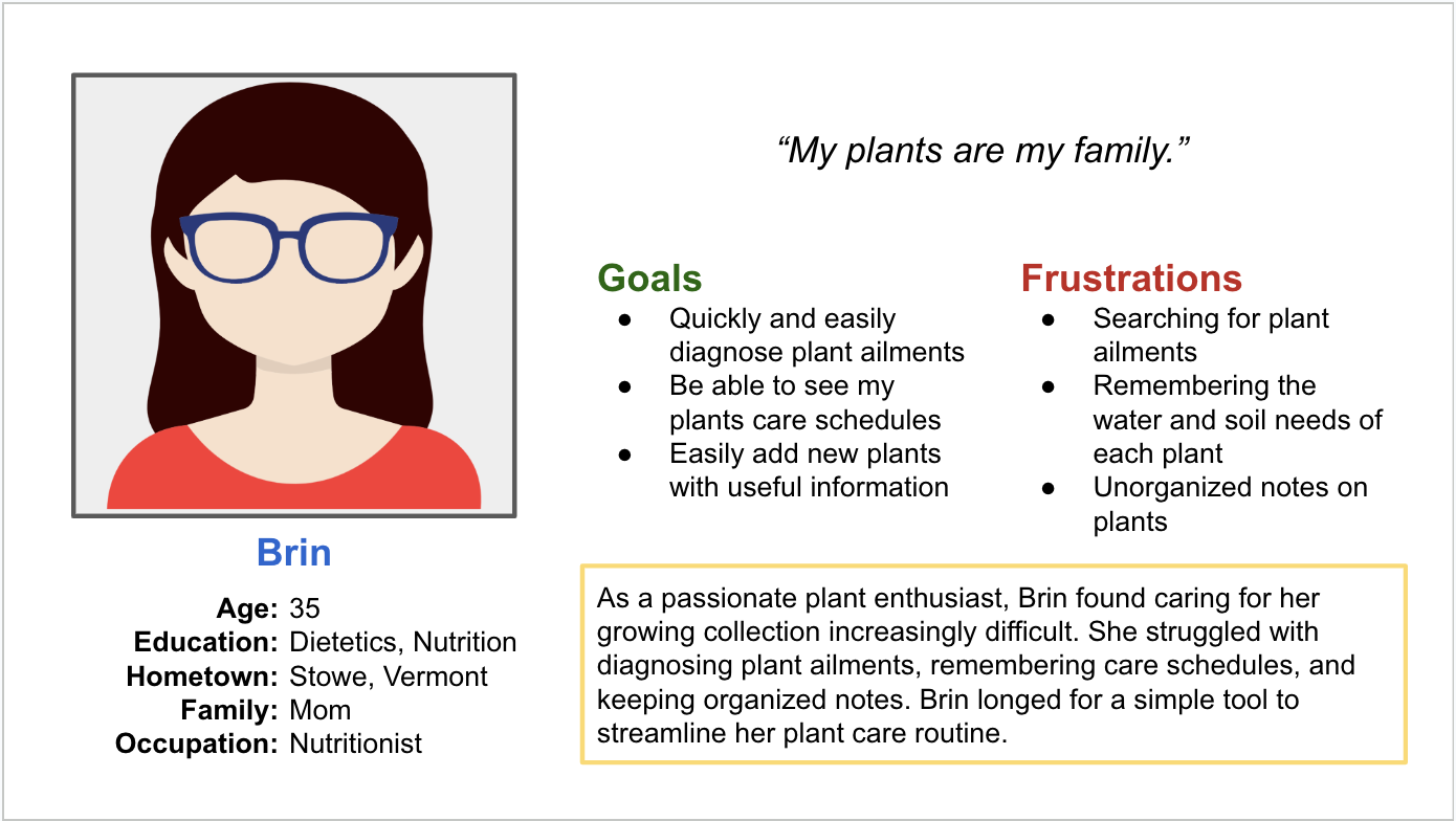
I created a user journey map of Brin’s normal experience taking care of her houseplants to help identify possible pain points and improvement opportunities where Panacea could help most.
Paper Wireframes
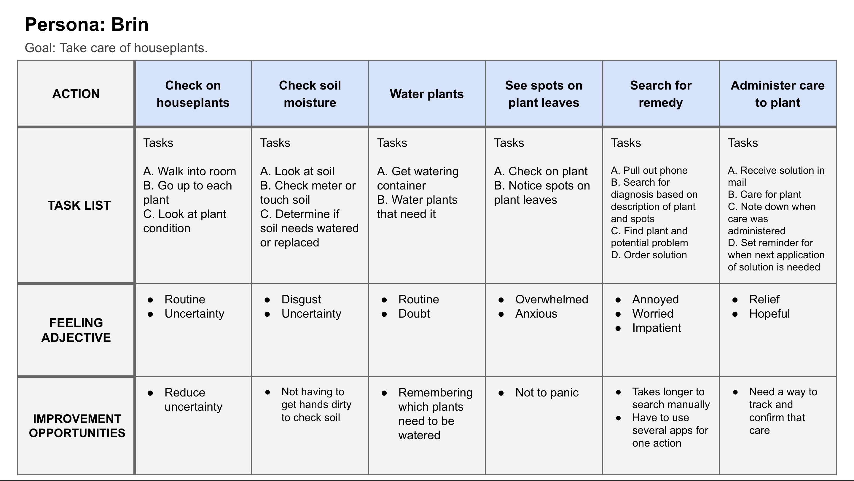
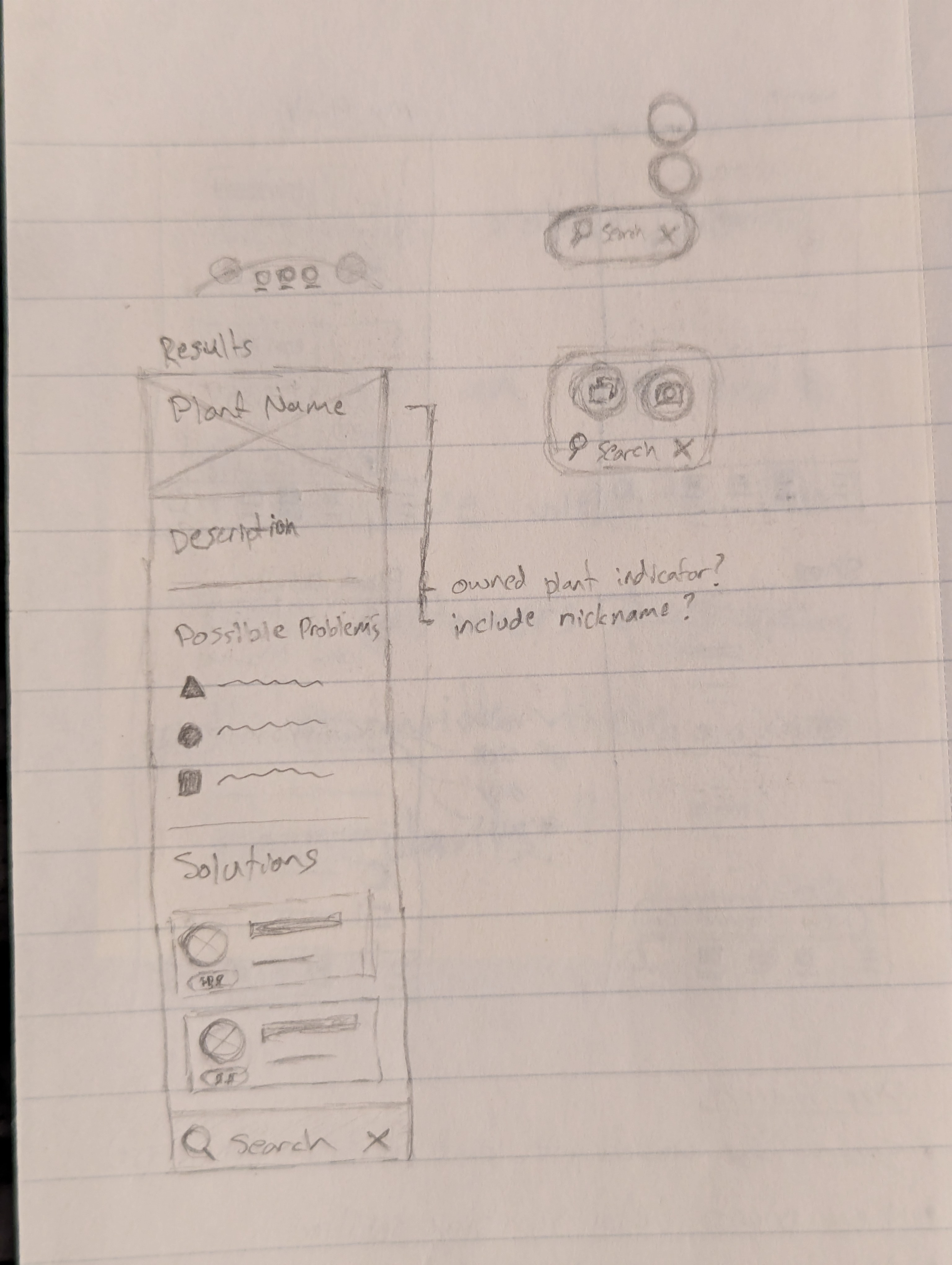
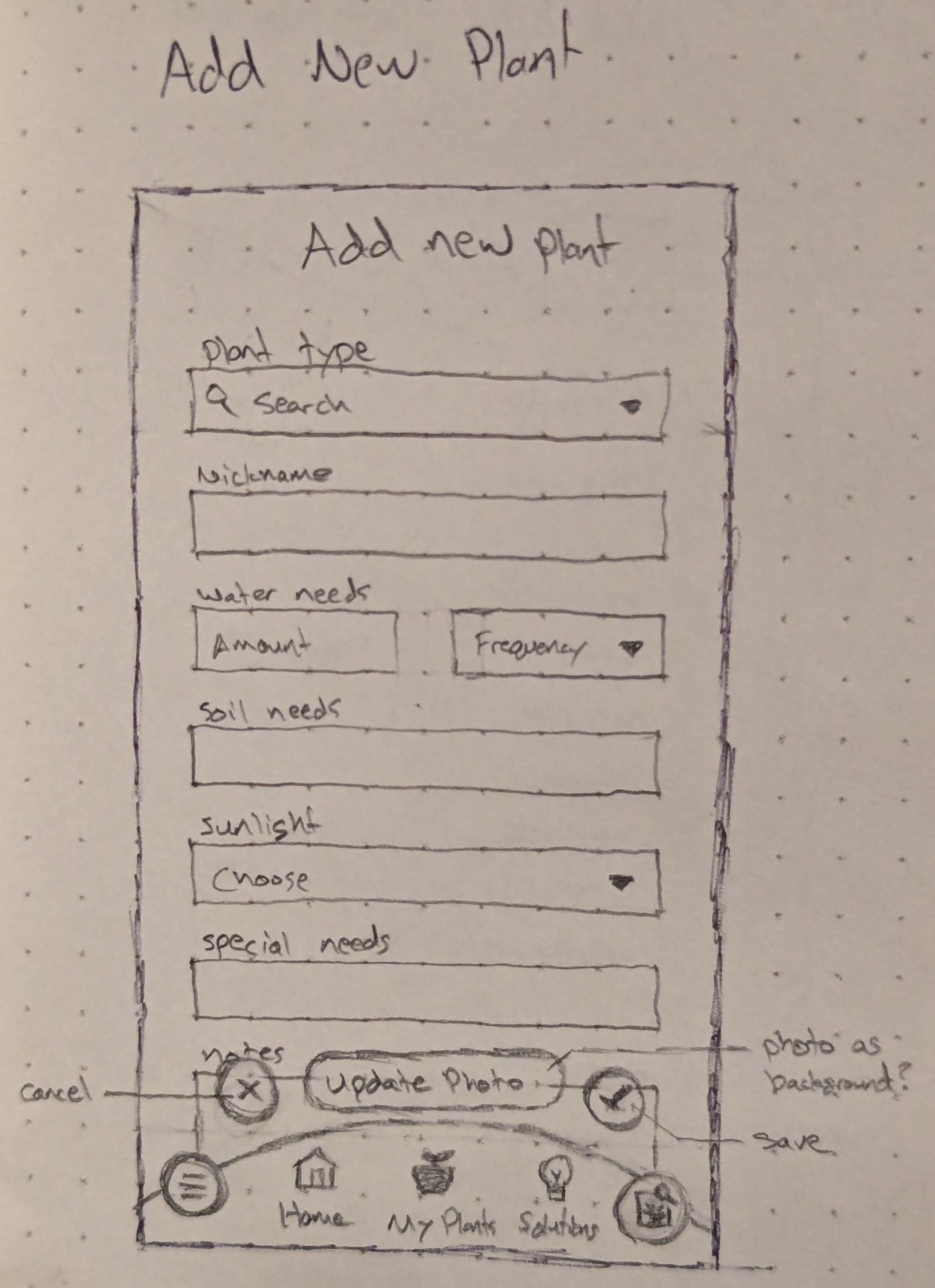
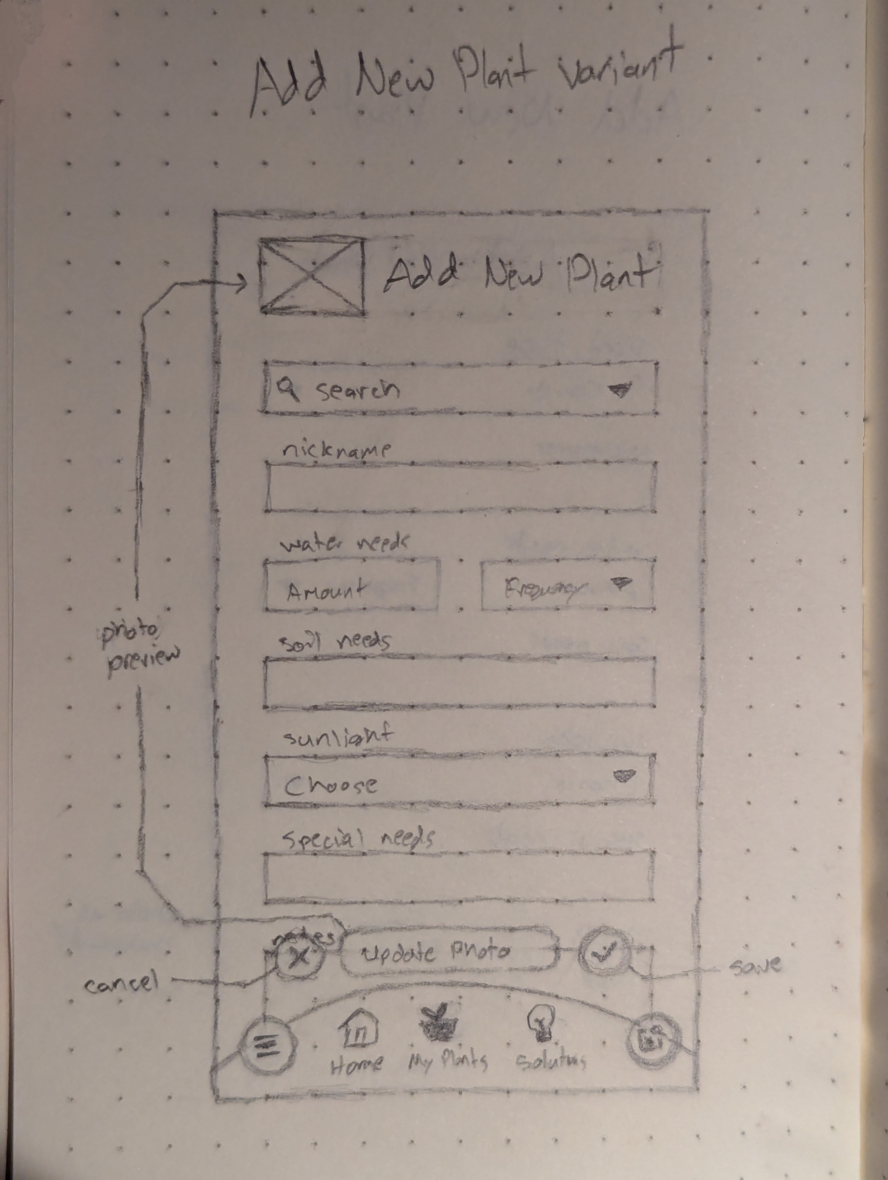
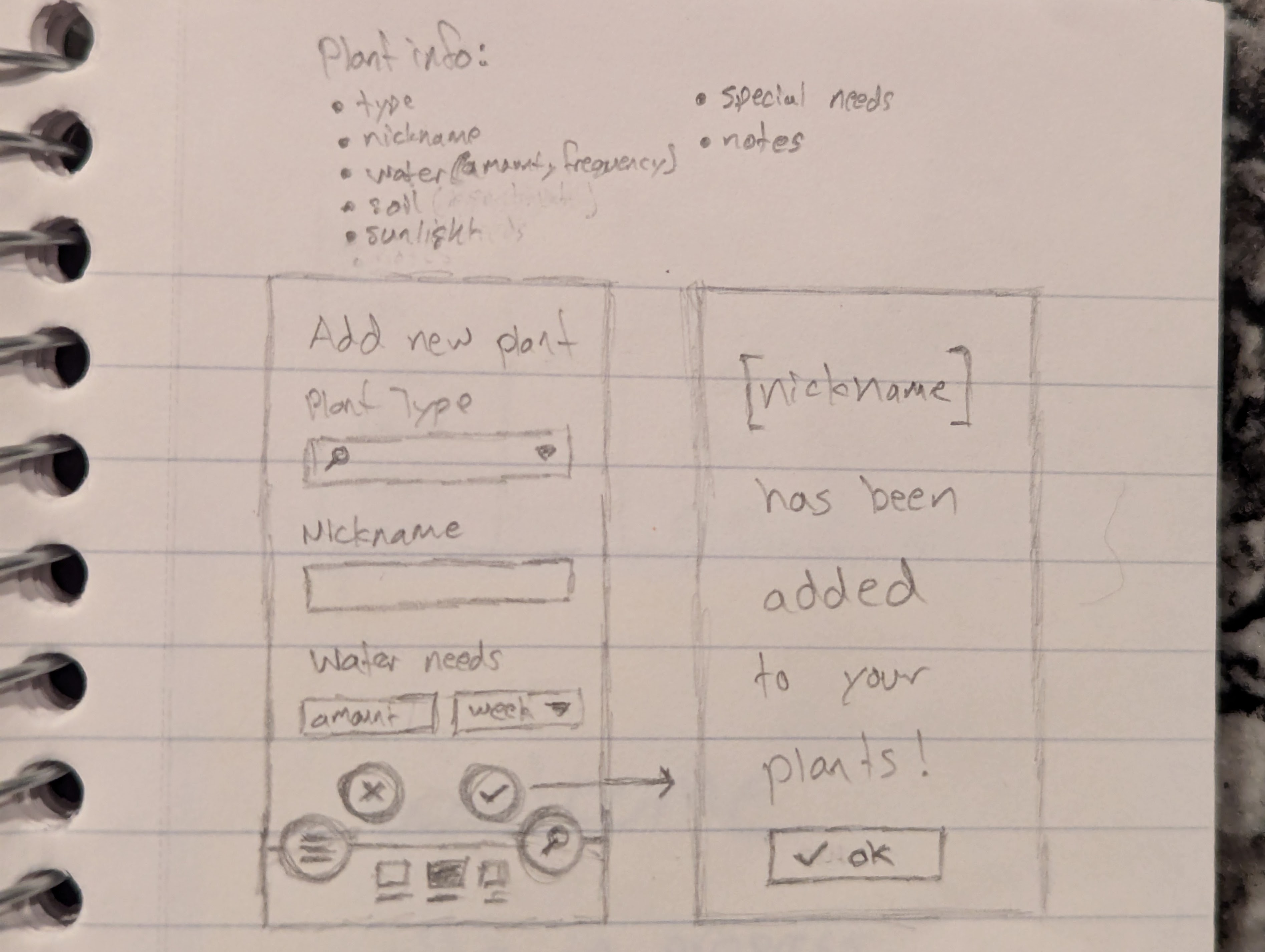
I wanted to initially have a search bar at the bottom, but it would hide the other main pages in the ‘side’ menu. I kept many of the controls and primary actions near the bottom since most phones are larger and the typical user’s hands are smaller.
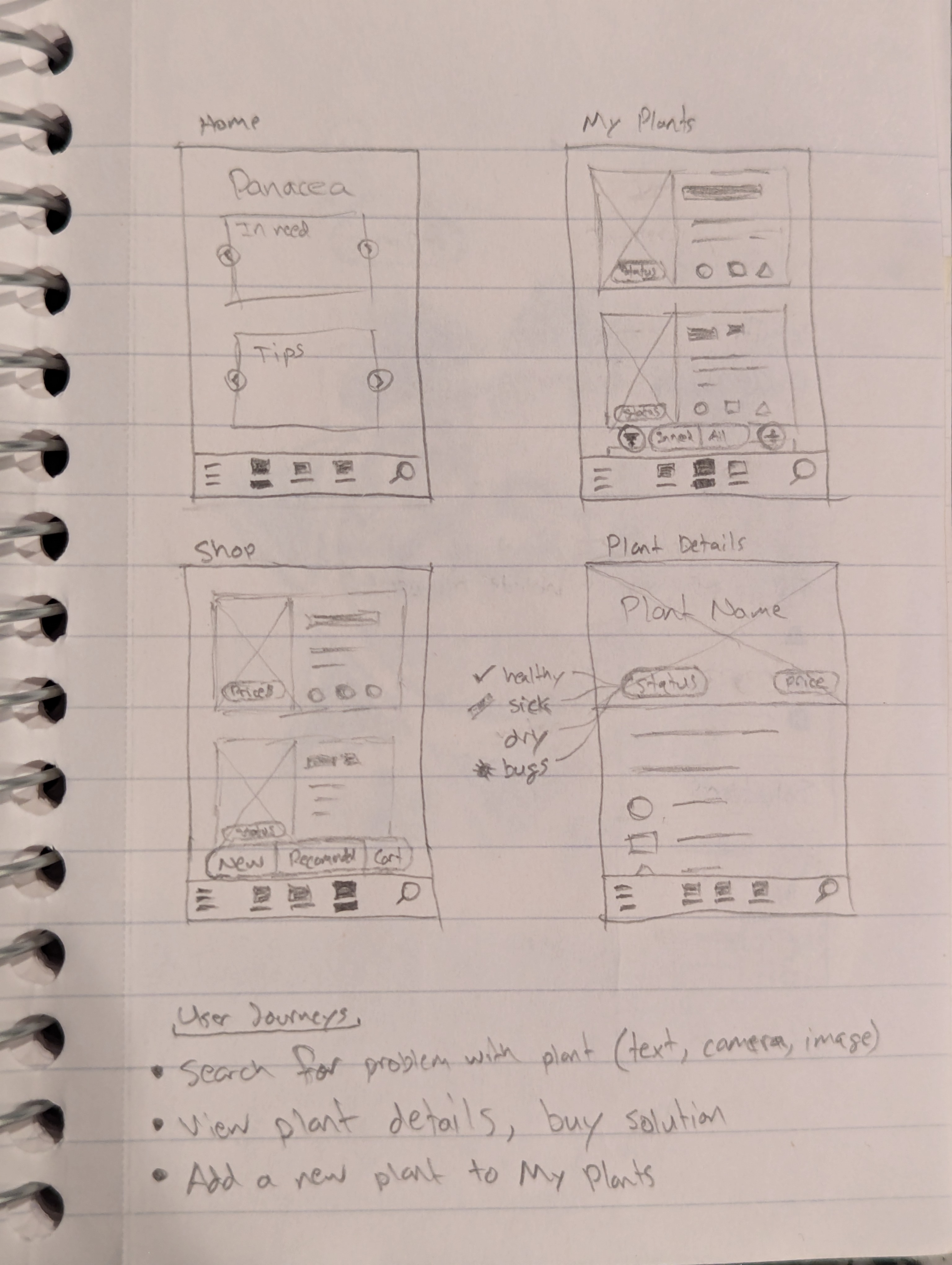
Digital Wireframes
Home page
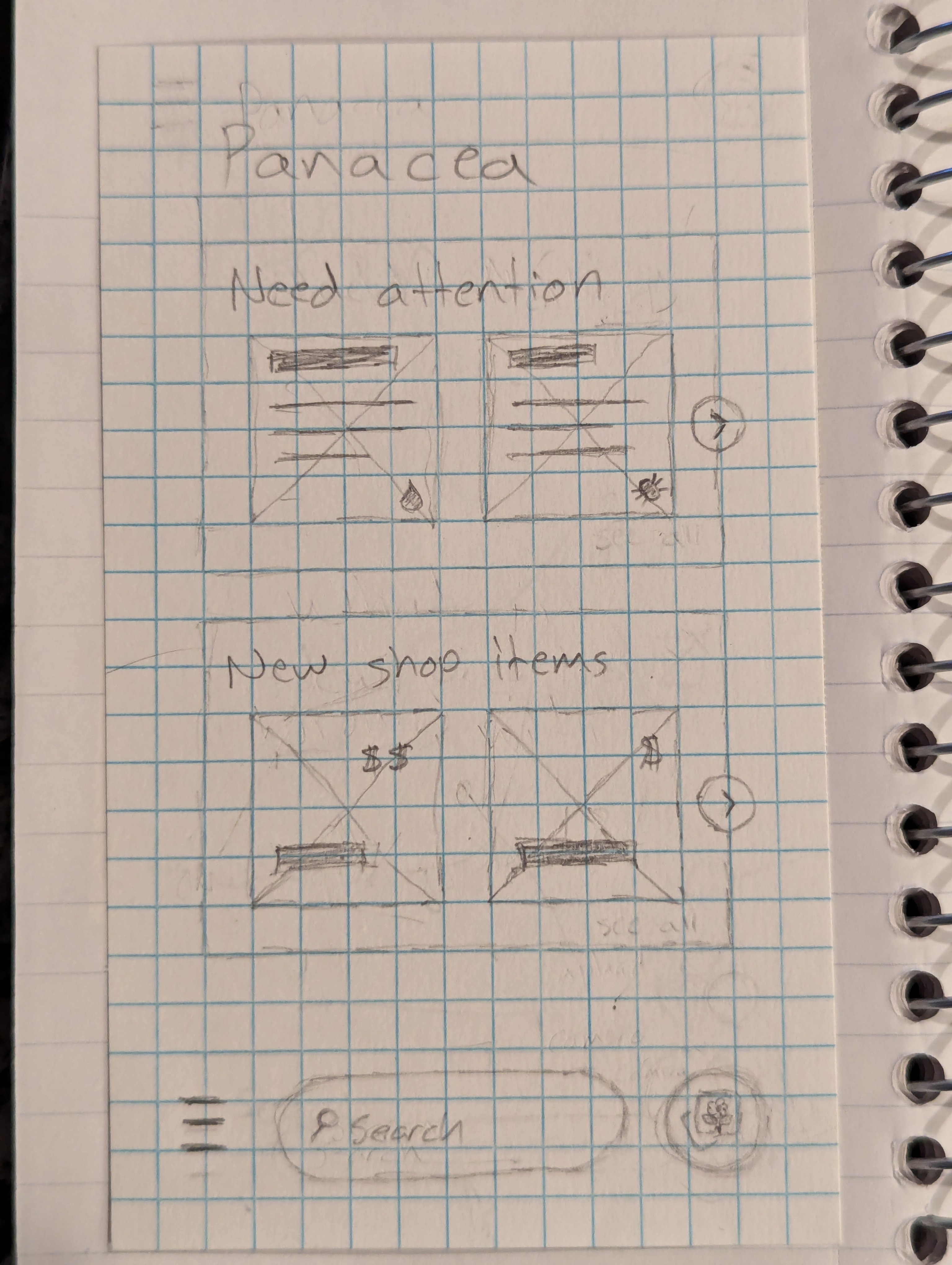
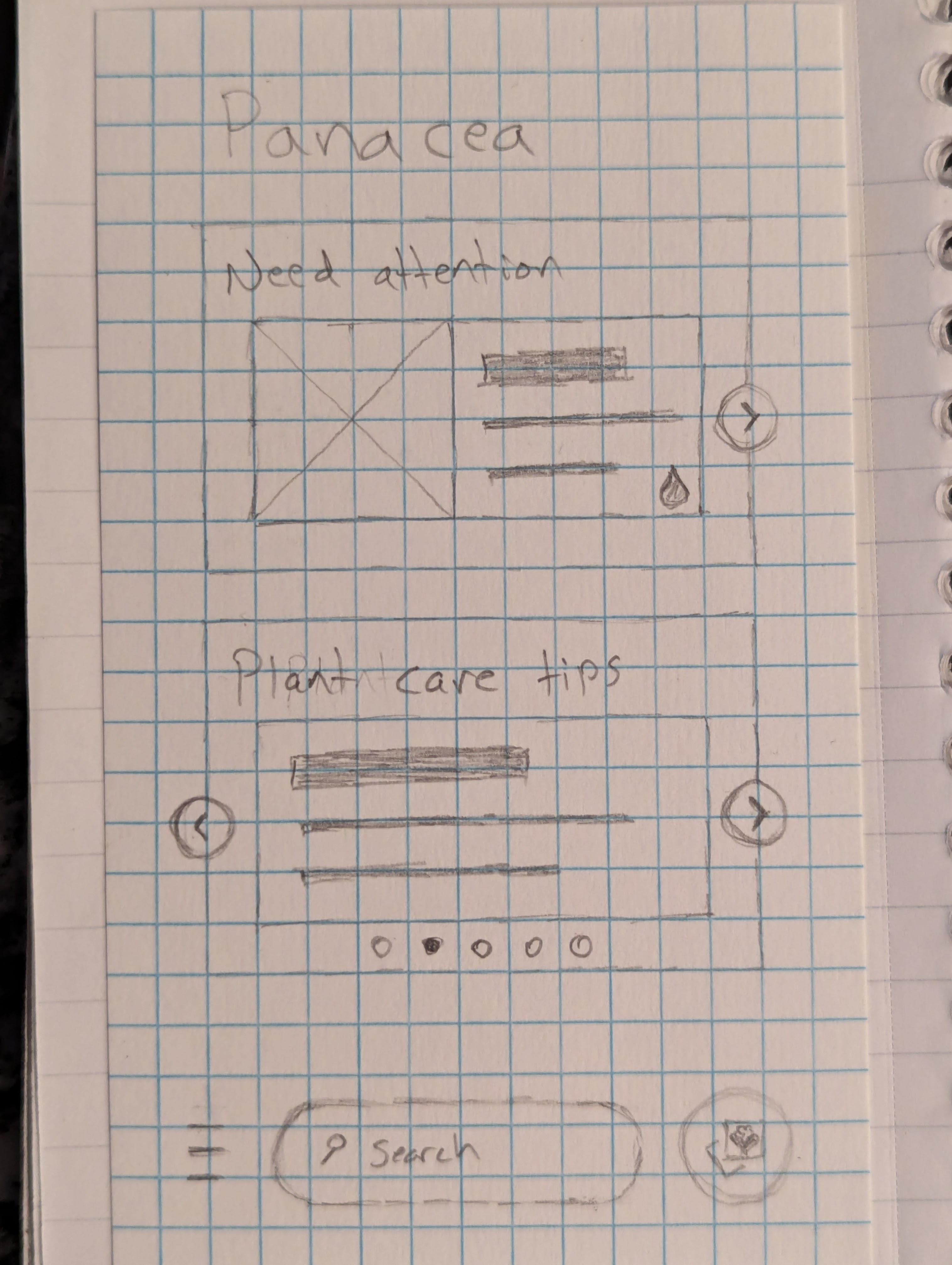
The Home page is meant to be simple, not too busy, and helpful for taking care of your houseplants.
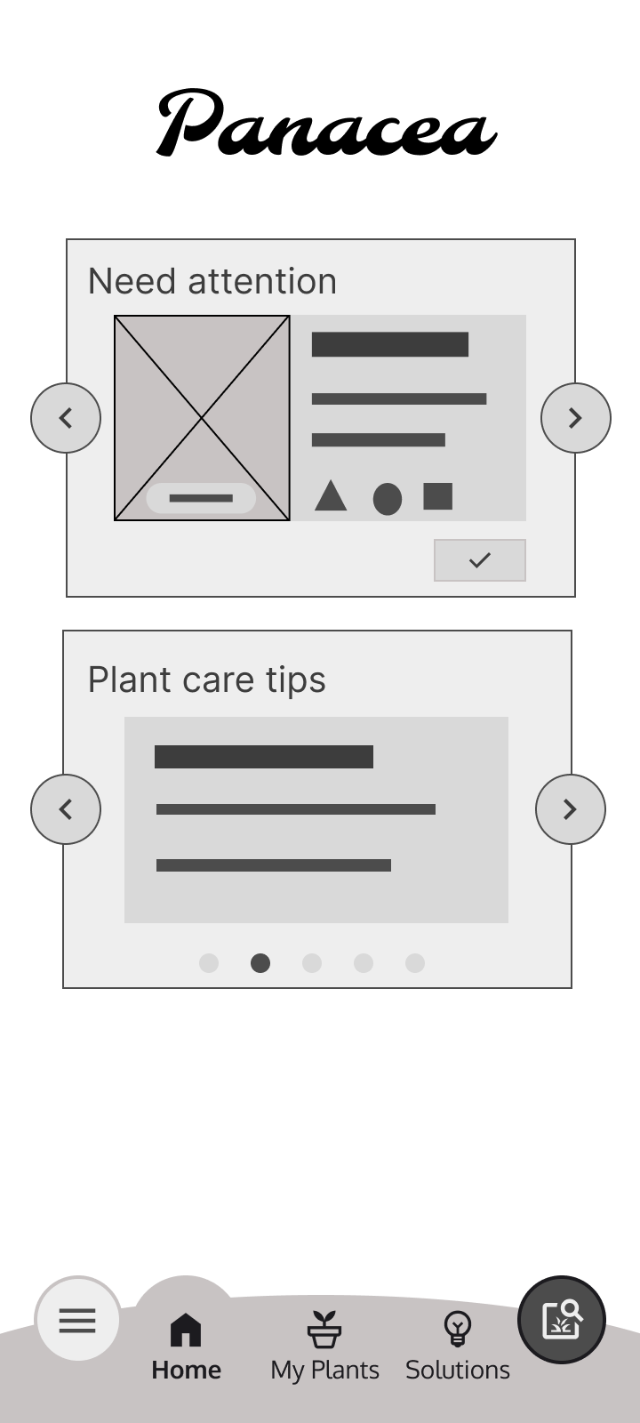
The top section is for plants that need care or attention today and the plant can be selected to view plant details directly. The search button at the bottom right brings up bottom modal with choice of media picker, camera, or text to search for plant type or ailment.
All Plants page
When going from one page to another, I wanted the controls placement to remain consistent. For example, the ‘add’, ‘edit’, and ‘save’ buttons are in the same place on the right side.
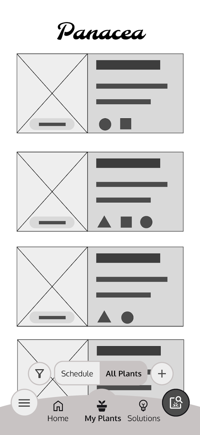
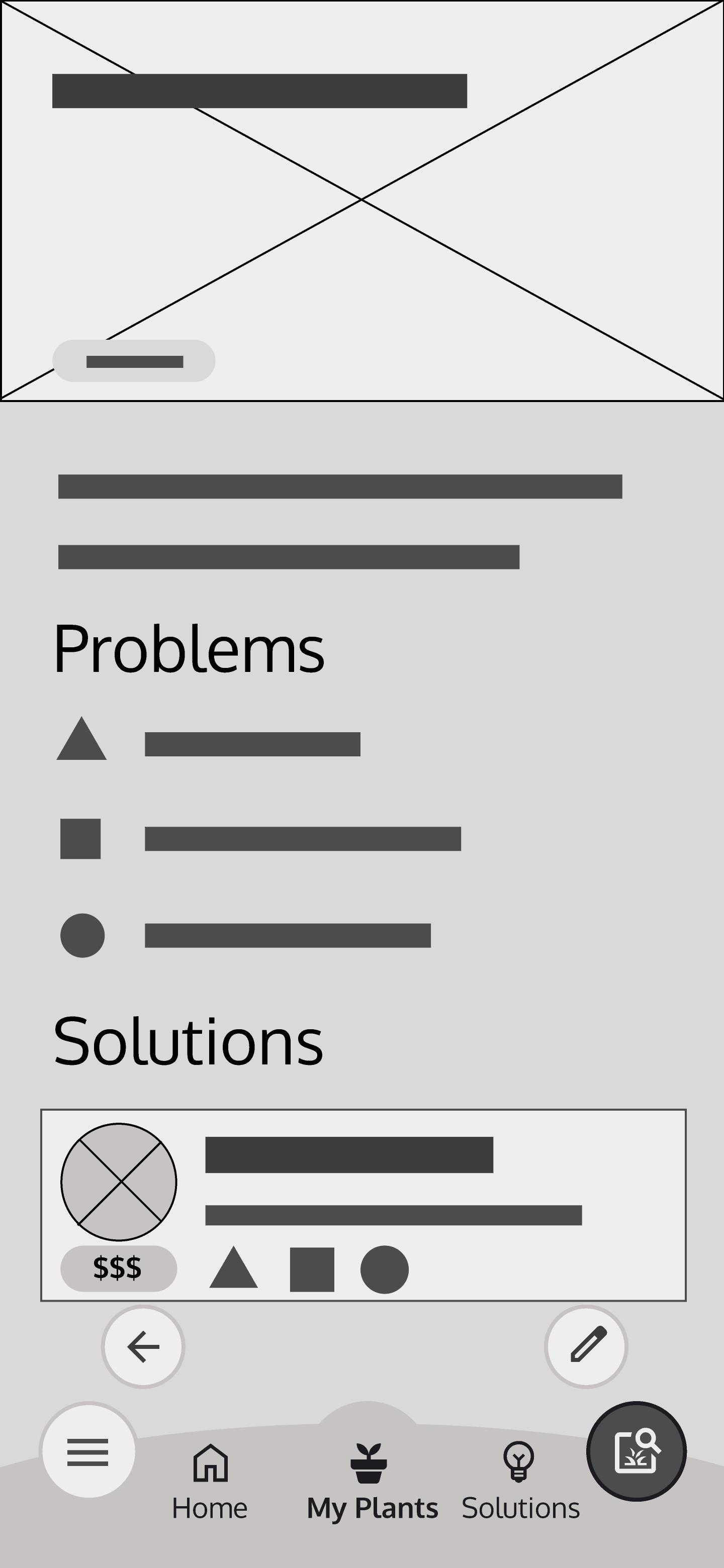
Select a plant from the list to see its details. Important controls are always at the bottom, easily within reach while holding a phone with one hand.
Low-fidelity prototype
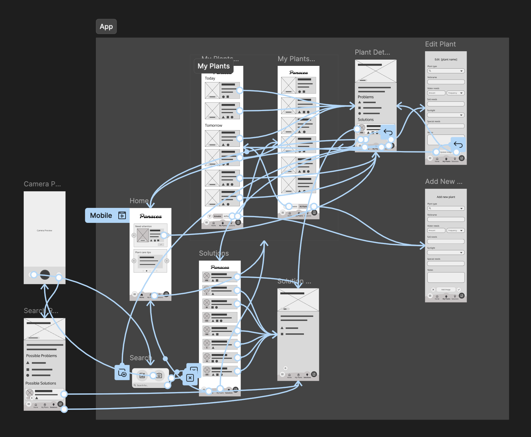
Since the app is fairly simple, I wanted to make sure that each of the main pages was almost always accessible with the bottom tabs and that the ‘back’ functionality would work as expected.
Usability Study
Round 1 (low-fi) findings
- The search function wasn’t obvious
- Some solutions won’t cost money
- Buttons at the bottom were nice